Theme Thursday - Contrast
Here is take on this week's Photo Theme - Contrast.
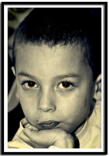
I took this picture in a dark restaurant so the colors and lighting are real poor. But I wanted to see if I can make it better cause its a rare picture of my son not looking silly and sitting still.
So here's the picture SOOC:
As you can tell the picture is pretty yellow, not real sharp and too dark. So I wanted to make it BW and change the contrast some. So I recolored the whole picture in BW using a brush and left just his eyes green, cause they are such a pretty color. Unfortunately, they look pretty dark too and its hard to tell that I left them in color. I cropped it some to get rid of some excess background. Then I played with the Levels and changed the contrast a bit until I liked both the look of the picture and the eye color (even though they came out more brown than green). Then I did some sharpening and noise reduction to make it look a little clearer and less grainy. I then burned the edges a little bit to reduce the background even further to emphasize his face more.
Its an attempt but I am not sure I love the way it turned out. I may try again and leave his eyes BW too.


8 comments:
I like the change. Nice work.
You are far cooler than I with the pictures! Dayum.
I love how his eyelashes stand out.
You're right. I love that contemplative pose. Nice job HG!
Wow - love the change - great photo!
Great pose and nice capture of your little man. I think you did a good job in changing it to black and white, and the more you work with these types of conversions the more you will find your "style" and what you like. :)
I am in awe of your photographic skills. Great shots!
Thanks for stopping by last week, work kept me occupied and I am still catching up on my reading!
I love the changes you made to this picture, the tight cropping really worked in making him stand out. (Well that and the color conversion.) Such a nice shot!
Post a Comment